


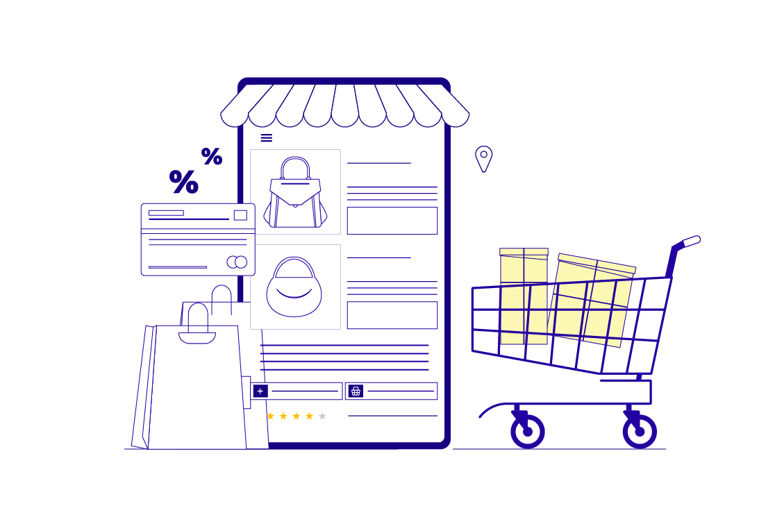
E-commerce checkout funnel is basically a visual depiction of every customer’s journey from product selection to completing its procurement. The funnel serves a vital purpose for the ecommerce business owners since proper optimization of this funnel is directly related to maximum conversions and reducing cart abandonment, resulting in increased sales.
Table of Contents:
- Introduction: The Cost of Inaction
- Where and Why Customers Drop Off: The 5 Silent Killers of Conversion
- How to Fix the Checkout Funnel: High-Impact checkout Optimization Strategies
- Real-World Impact: What Happens When You Get It Right
- BluEnt’s Approach: Built to Convert
- Let’s Rescue Your Lost Revenue
You have made your website good looking, hooked the customers, and brought them to the brink of conversion, still you don’t have sales? Why?
The answer lies in the silent killers of your e-commerce checkout funnel:
-
Friction
-
Confusion &
-
Mistrust.
These are silently pushing your shoppers away right before they buy.
A 2018 study by Baymard Institute looking at the reasons for abandonments during checkout took data from 41 separate studies and concluded that most of the checkout abandonment occurs because extra costs are too high (shipping, taxes, and other fees), account creation is required, and the checkout process is unnecessarily complicated.
Most of the dropouts are shown by the GA at the time of checkout and few at the add-to-cart stage. What can be the reason?
Where and Why Customers Drop Off: 5 Silent Killers of E-commerce Checkout Funnel
You have spent time, budget and energy driving traffic to your site only to see potential customers vanish at the final step: checkout? Frustrating, isn’t it? These silent killers, tiny UX missteps, confusing options or a lack of trust can quietly sabotage your conversions.
We’ll uncover the five most common reasons shoppers abandon their carts and what you can do to stop the leaks
Inadequate product information
In 2025, product information isn’t just a UX issue, it’s a revenue leak. Before customers make a purchase on ecommerce, they have already compared features, checked videos, read reviews, and calculated delivery timelines. Today’s buyer expects-
-
Rich product descriptions
-
Shipping timelines and return policies
-
Clear benefits and use cases
-
Visual content
Performance and load time
When your website speed is slow, your customers don’t wait, they vanish. 53% of users abandon a mobile site if it takes more than 3 seconds to load. (source Google). A slow page doesn’t just frustrate but creates perceived risk.
Here’s what buyers expect in 2025
-
Page must be loaded in 3 seconds, especially on mobile.
-
Navigation should be intuitive, responsive, and smooth.
-
Site speed isn’t about just convenience, it’s about credibility.
Complicated E-commerce Checkout process
A confused, multi-step and poorly designed checkout process is one of the main reasons why buyers abandon carts at the time of payment. If buying online feels like work, customers will quit halfway. Buyers’ expectations:
-
Guest checkout by default
-
Auto-fill support and address validation
-
Shipping cost, taxes and delivery time to be shown upfront.
How to Fix the E-commerce Checkout Funnel: High-Impact Optimization Strategies
Before you blame your ads or pricing, look at your checkout funnel. Fixing your ecommerce sales funnel is the real unlock to more conversions, fewer drop-offs and happy customers. Here’s how to optimize every stage of your ecommerce funnel for maximum impact.

Optimize for Mobile
Most of the shopping today is happening online through mobile devices. Yet many checkout pages still have a clunky interface, hard to click elements, and endless fields which frustrate mobile users, causing them to drop off.
What to do:
-
Implement autofill for contact and payment information.
-
Test on Android and IOS devices regularly
-
Use mobile first responsive layout
-
Keep buttons for large, short, and scrollable content.
The above results in smoother checkouts, reduced friction, and higher completion rates on smaller screens.
Use Consistent Branding
Customers visited the website, liked the product, and added the product to the cart. They are ready to pay. But then they land on the checkout page that looks completely different. Inconsistent branding causes unnecessary doubt and hurt conversions.
What to do:
-
Maintain consistent logo, colors, font, and tone of voice.
-
Build brand trust with secure payment badges and trust seals.
-
Avoid redirection to unfamiliar looking payment gateways.
This results in a seamless brand experience that builds trust at every step.
Multilanguage, Multi-currency & Geolocation
Your customers could be across the street or across the world. But if your check out experience doesn’t speak their language or have their local buying habits, they are likely to abandon their cart.
Example: A shopper from Netherlands sees price in U.S. dollars, shipping in miles and all text in English. That disconnect causes hesitation. Discomfort builds in –
Will I be overcharged for currency conversion? Can I trust this store to ship to me? And by then you have lost sales.
What to do
-
Integrate reliable currency converters and clearly display exchange rates and shipping/tax estimates. Let shoppers view and pay in their local currency.
-
Use geolocation to auto-detect language but always give user’s manual control to switch.
-
Tailor shipping options estimated delivery time and payment gateways based on the shopper’s region.
All the above will not only reduce drop-offs but also build brand credibility across borders.
Offer Guest checkout
Asking users to sign up before they buy creates a major speed bump in the path to conversions. Nothing slows down the momentum like forced account creation.
What to do:
-
Only ask for essential information like name, email, address, and contact information.
-
Give users an option to users to create account after purchase.
-
Provide a fast, no friction guest checkout option.
The above results in less friction, especially for the first time buyers or time-sensitive purchases.
Optimize landing page
A weak landing page can sabotage the entire funnel. The checkout funnel doesn’t start at the cart; it starts the moment user clicks through from an ad, email, or search result. And if your landing page doesn’t meet their expectations within seconds, the journey ends before it even begins.
What to do:
-
Keep layout clean and focused with a single CTA.
-
Align your landing page messaging with your ad or campaign source.
-
To make sure product details, pricing, and benefits are clear.
Example-
A fast fashion brand noticed that a product landing page for a trending coat had a bounce rate for over 60%, despite running paid campaigns. And the actual “Buy now “was below the fold.
Issue: Page was cluttered with cross-sells, multiple CTAs
What they did: Removed non-essential elements, streamlined the layout with one CTA (Add to cart) and moved key product information and benefit above the fold.
Result: Conversion rate increased, Average session time improved, Cart initiation rose steadily.
Higher engagement, stronger intent and more users results in checking out in the first place.
Real-World Impact: What Happens When You Get It Right
Getting the e-commerce checkout funnel optimized in the right way significantly leads to positive impacts for the business such as higher conversion rates, increased customer loyalty, and better ROI generation. A well-designed funnel directs customers seamlessly from initial awareness to purchase, attending to their requirements at each stage and providing a positive user experience.
1. Reduced Abandon Cart Rates
A well optimized checkout experience reduces the bottleneck that causes hesitation. Guest checkout, faster page loads, trusted payment options, and relevant product information can make shoppers feel confident to purchase without cart abandonment at the final step. A smoother ecommerce checkout journey from cart to confirmation.
2. Increased Conversion Rates
When every touch point like ad, landing page, product display, checkout is aligned and intuitive more users follow through. Clear CTAs, strong messaging and localized content drive better engagement and ultimately higher conversions.
3. Faster Time to Purchase
Optimized layout, auto-fill fields and mobile friendly flows help users to get from product to payment without delays. Users spend less time navigating and more time checking out, increasing your revenue cycle.
4 Higher Repeat Purchases
A smooth and satisfying first experience sets the tone for ongoing brand loyalty. Customers who trust to check our process are more likely to return, especially if post purchase process like order tracking and communication are seamless.
BluEnt’s Approach to E-commerce Checkout Funnel: Built to Convert
At BluEnt we don’t just provide ecommerce development services, we engineer every step of the ecommerce checkout experience to maximize ROI. We focus on conversion first architecture, user centric design and scalable innovation on any platform. Our team focuses on performance-led checkout optimization to help you improve conversions and reduce drop-offs.
Let’s Rescue Your Lost Revenue
Running a business, your goal is not only to get more visitors to visit your site but also to convert them into paying customers. Getting rid of these massive conversion killers can make that more successful.
If you’re struggling to raise your conversion, go back to basics. Think of how people browse the web and what they’re looking for. Think about how consumers pick brands that they want to support. It’s time to stop losing potential revenue at the last step. Let’s fix it with proven cart abandonment solutions that convert.

 Magento AI Integration: Transform Your eCommerce Store Into an AI-Driven Revenue Engine
  Sync Magento Store with Other B2C Ecommerce Platforms: A Guide to Multichannel Integration
  MACH Architecture for Unified Global Multi-Store Ecommerce: The Future of Headless Commerce
  Setting Up Global Ecommerce Stores Without Duplicating Infrastructure